Tuesday, 22 March 2011
Questionnaire result graphs.
For my first question, i asked the age of the audience. My result show more people are age 16 or 17,this is because i got my results from students in college. However, this fits my target audience of teenagers and young people.
My second question was what does the magazine title suggest. Most answered different music, under the indie genre, as they recognized that the title is the words indie and difference combined.
My 3rd question was about genre, and what does my magazine cover suggest. The results show that 50% of the audience recognized my intended genre of indie... The other 50% said either rock or pop, which is also a genre for my magazine, as it was an indie pop rock hybrid.
Participants of the questionnaire answered that the colour and image gave them this idea, and that the advertisements for festivals, the model and the models name all connote this indie genre.
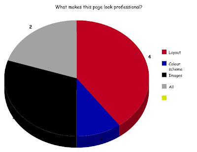
For question 5, i asked what makes my cover look professional. The majority answered layout. However, it was a mixed result as 2 people said all, 3 said images and 1 said the colour scheme.
However my next graphs shows that 4 people said the colour scheme made it look less professional, 3 said image. However 3 people said nothing made it look unprofessional.
For question 7, i asked whether my magazine seemed genuine. 9 out of 10 answered yes. I think this is due to it containing the main conventions of a magazine, the title, sub headings, images and tag lines.
For question 8, i asked about my contents page. The majority said it informs. I think this is because its basic, and uses no imperative language to pursuade people to read on. However 4 people chose encourage over inform.
For question and 10 i asked about my article, and whether it seemed like a genuine piece. The majority answered yes, i think this is because it used conversational, colloquial, flowing language. And the colloquialism emphathises with the target audience.
My last question is also about my article, and whether the layout is effective and appropriate, everybody who took the questionnaire said yes. This is because it's easy to read and also uses all the conventions of a professional article: tags line, heading, sub headings, feature image and quotes.
Subscribe to:
Post Comments (Atom)


No comments:
Post a Comment